
How often do you just step in and see a room that is fully charged or somewhat calmed down instantly? Colors are not only an image phenomenon, but they have a very deep effect on our feelings too and can totally change the atmosphere of a space. Mastery of the notion of color psychology is a very strong weapon when it comes to the design of your fantasy house. We can use color to bring our emotions closer to the feeling we want, by increasing their power. But using color is only one of the many techniques that an architect uses to create a space that is more than a background for life.
Warm vs. Cool Colors:
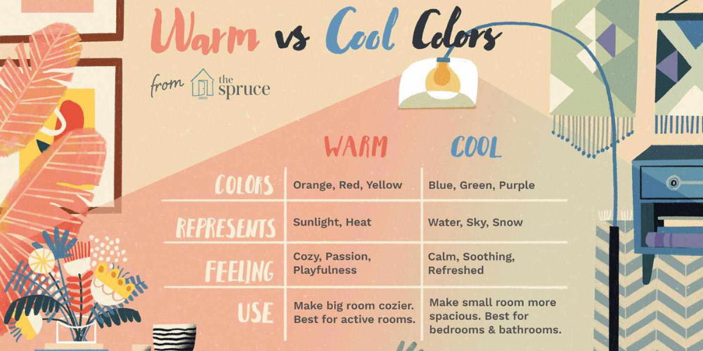
· Warm Colors: Reds, oranges, yellows. These vibrant tones move actively and show energy and passion. They are great for small spaces if you want them to feel more personal or for almost anything in the workplace where you want to energize people.
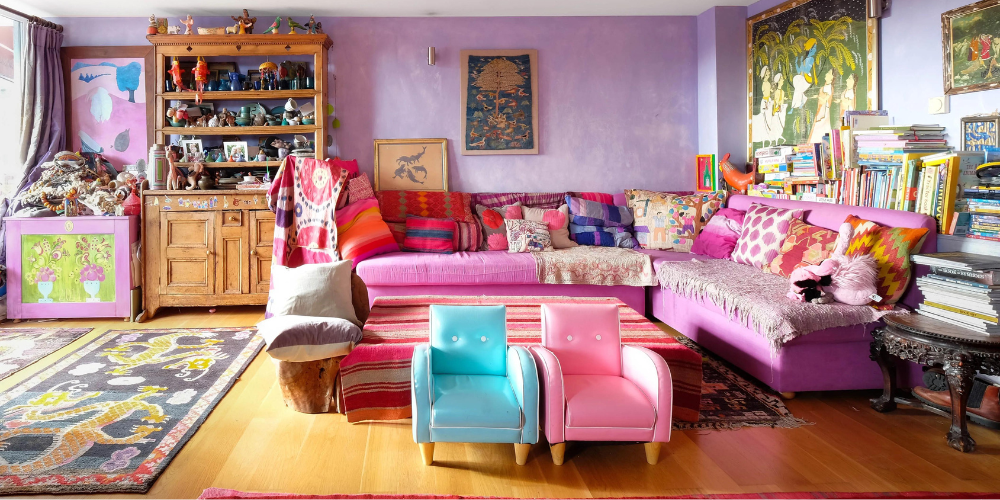
· Cool Colors: Blues, greens, purples. These colors are restful and they are very well recognized for their ability to do that. They can be used in bedrooms, bathrooms, and living areas. Here they do their job – to make you relax, and feel good.
Considering Color Value:
· Light Colors: They make the room look bigger, make it feel airy and wide, when natural light is added. Light colors can increase small areas and offer a visual connection to the landscape outside.
· Dark Colors: Can be bold and full of elegance. They are especially good for big rooms or for areas, which one desires to highlight. However, be careful when using too many in a small, as they annoy more than they please.
The Power of Specific Colours:
· Red: It awakens the body and brain, it is nice for majestic walls or dining rooms.
· Orange: It can attract, through inspiration, the youth or the adults who attend gyms or workspaces.
· Yellow: It is a ray of sunshine, it is a good idea for kitchens or bathrooms.
· Blue: This is the color that gives a feeling of happiness and tranquility, thus best for the bedrooms or living rooms.
· Green: Stands for nature and balance that is suitable for creating a calm and peaceful environment.
· Purple: A vibrant color associated with leisure and calm, which is perfect for creating a serene home spa.
Neutrals as a Base:
White, gray, and beige are inevitable to put in a room as they are the ones that create a basis for any other style of the room. This blank canvas will let you have a wide range of color options. Besides, this will allow the color of walls and furniture, as well as artwork, to stand out. They provide a clean canvas for pops of color and allow furniture and artwork to take center stage.
Remember: Personal color perception is subjective. Thus, try to figure out the natural light in your location and how it interconnects with the colors you select. Try various color samples and find out which colors to feel in the room you live in.
Need Help Bringing Your Design Vision to Life?
If you are in the turmoil of the color issue or need help getting your interior design concept to yield, you should seek the help of Real Estate Dekho. We have a team of expert interior designers that will help you find the solutions you need to change your space into a place with its style. Releasing your invisible designer, surrendering to color psychology, and redesigning your house into a shelter that mirrors your personality and well-being are the names of the game here.